DEHD Tour Promotion Proposal

created by @faeton

About the project

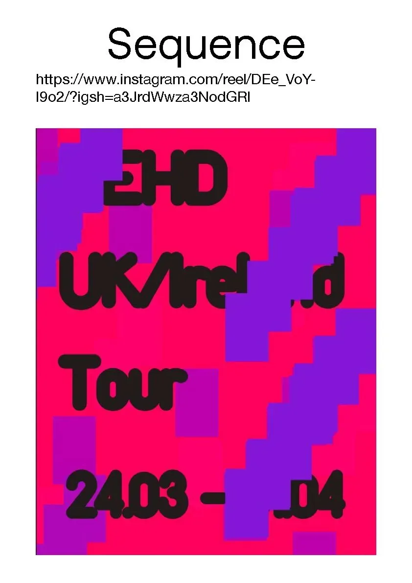
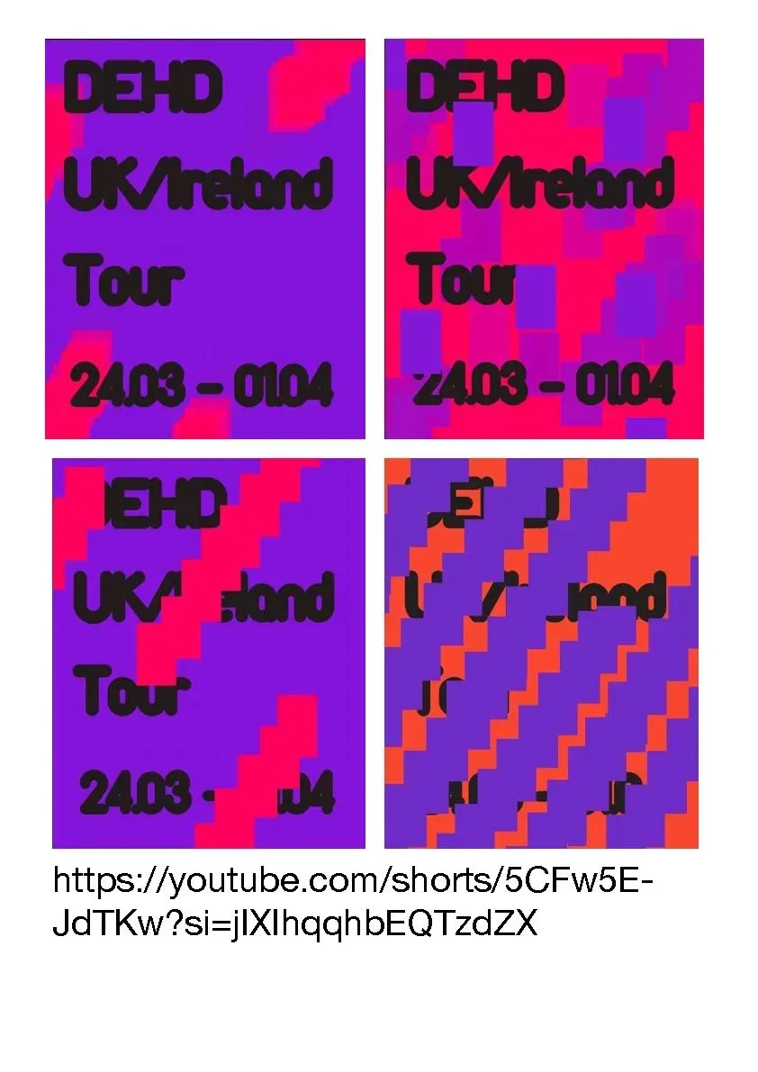
This module considers the role of sequence, a fundamental approach within visual communication. I explored how assembling static images and applying sequential media can construct moving images or systems, creating complex messages or visual narratives. The study of this subject area is fundamentally important as we engage with continually evolving creative technologies. Looking at the subject from three areas, static, moving, and interactive sequence, I became familiar with introductory concepts central to the subject and applied a range of creative approaches and technologies within the exploration and development of sequential messages. There was an opportunity within the module to look at visual communication through the sequence in both linear and non-linear contexts.
My approach

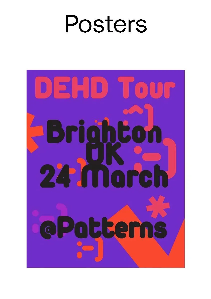
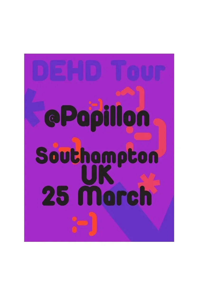
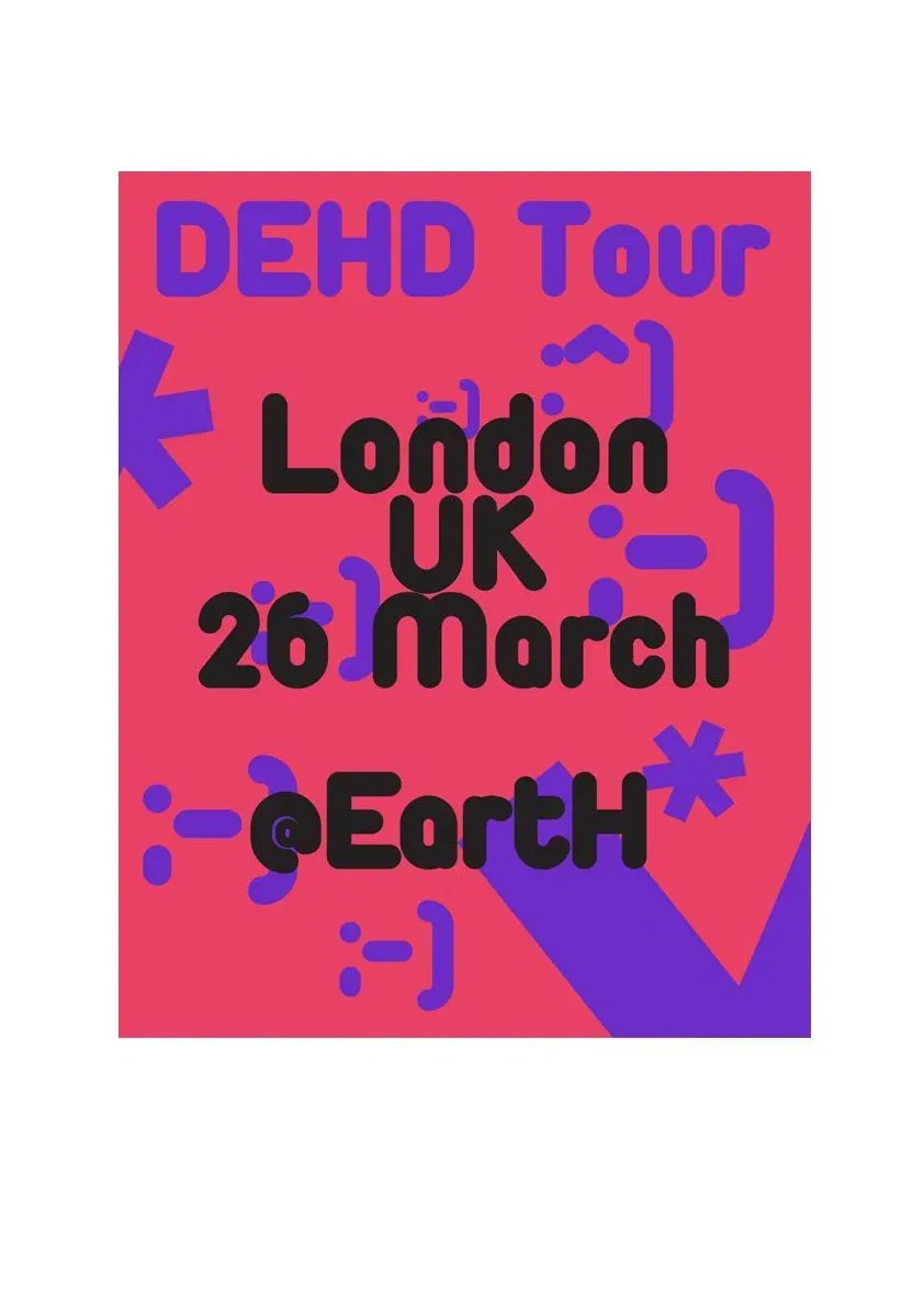
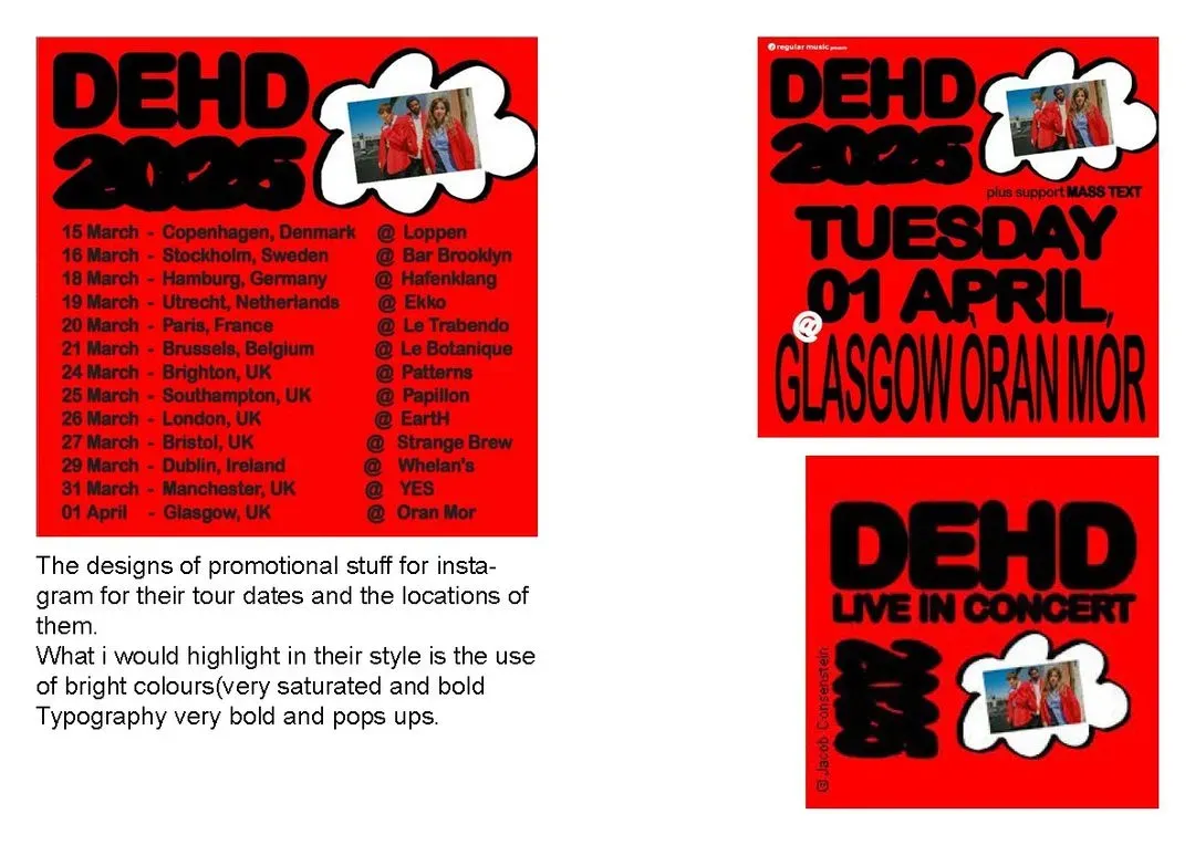
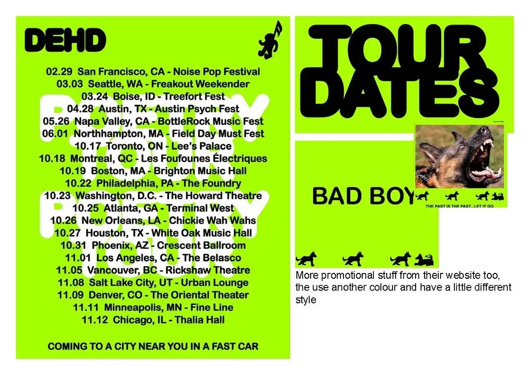
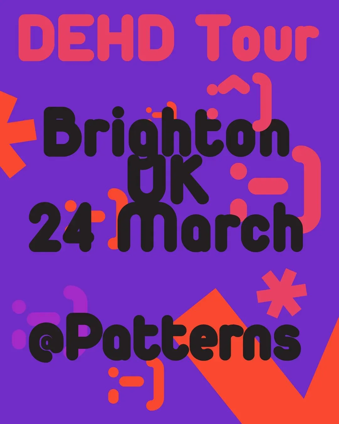
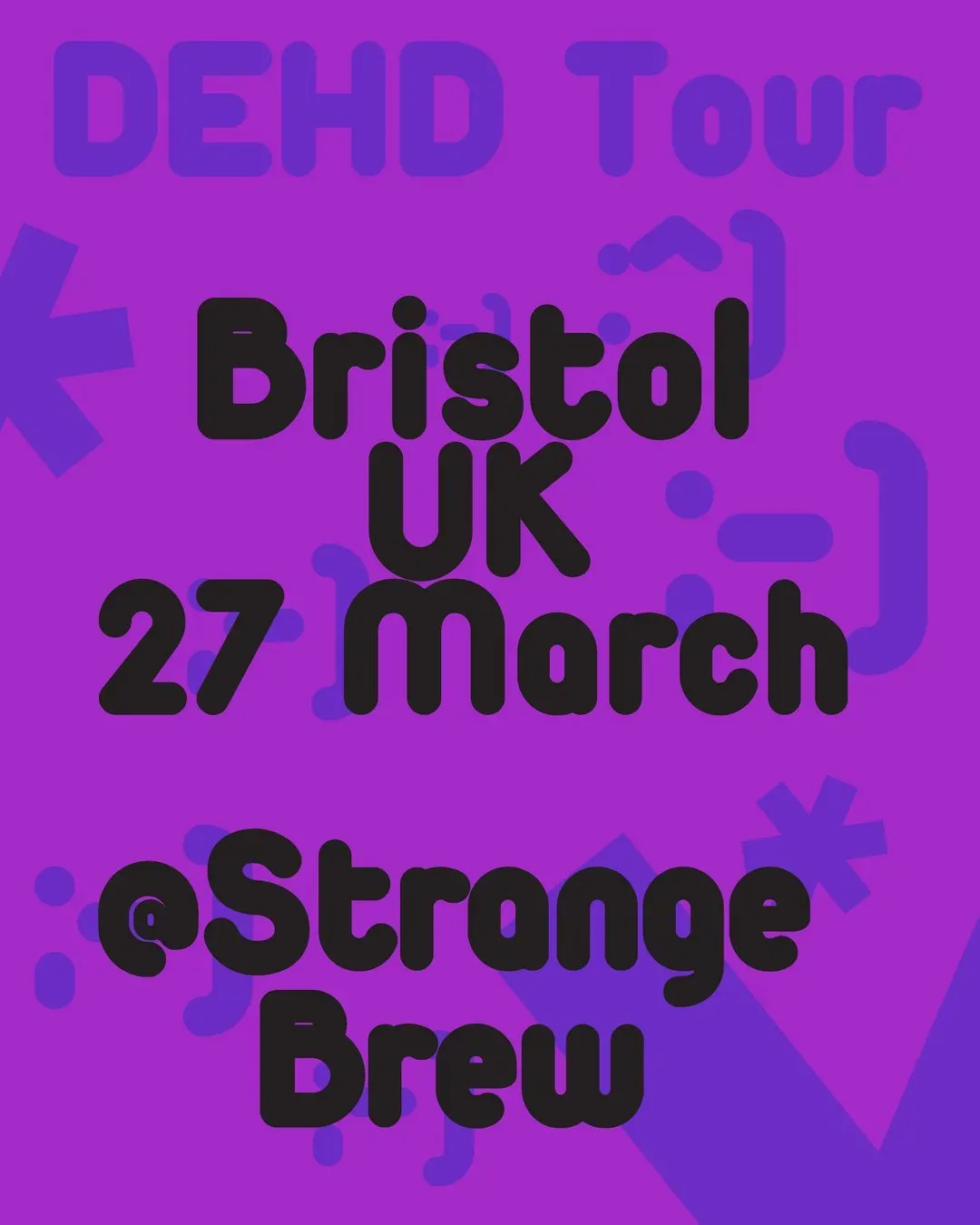
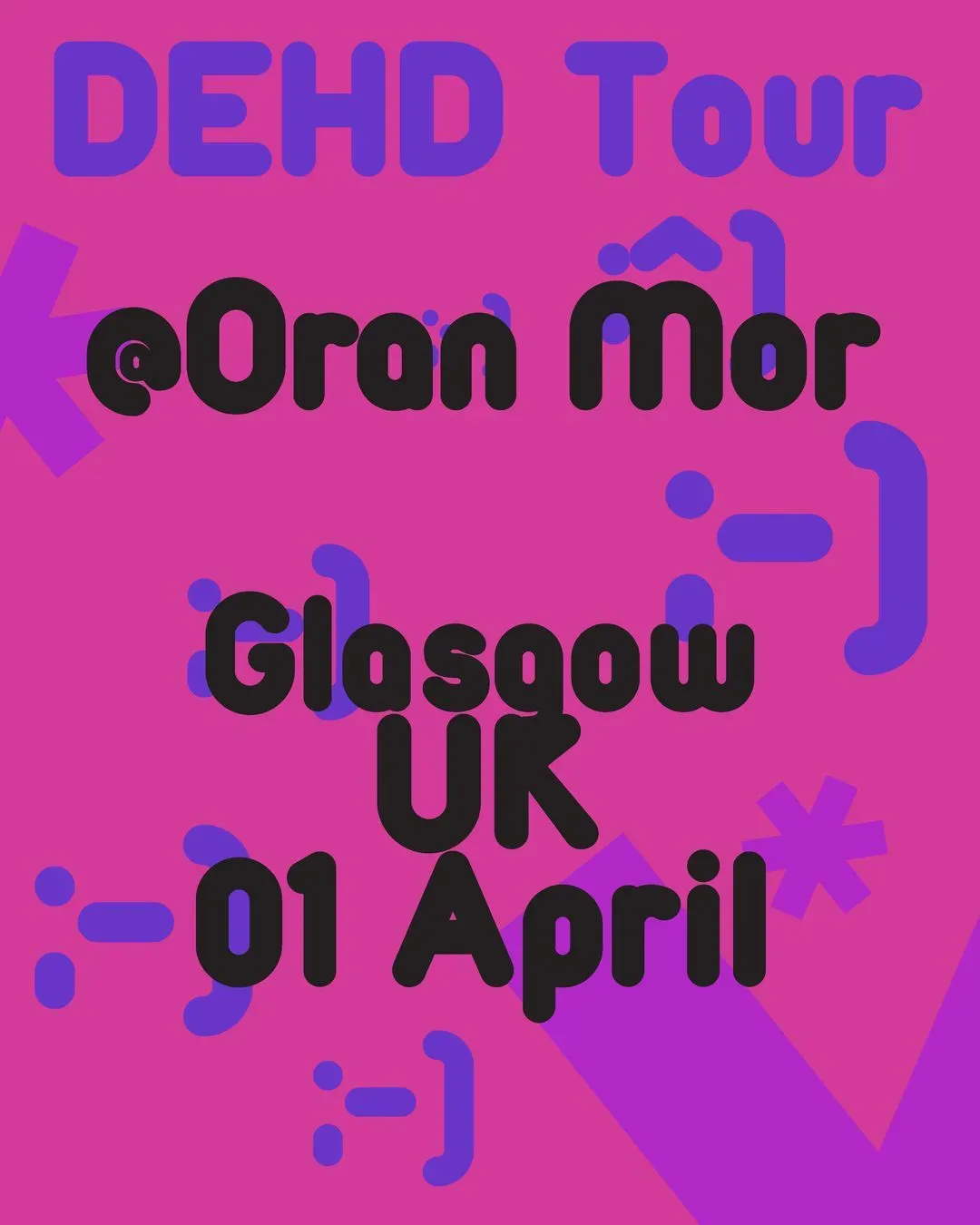
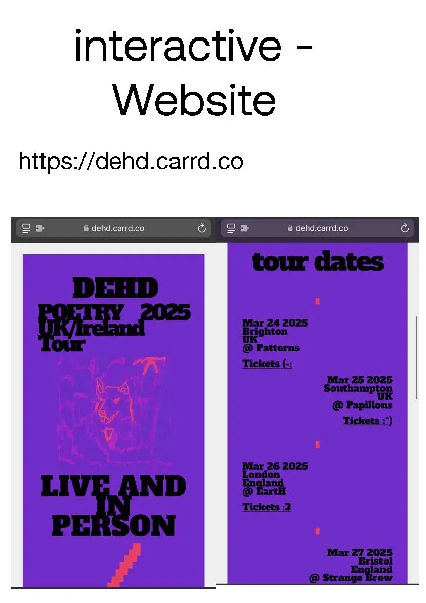
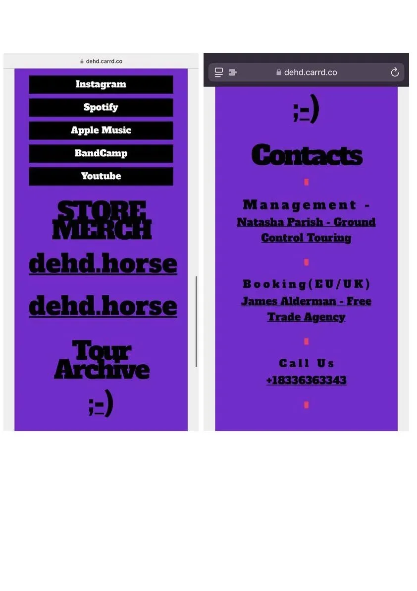
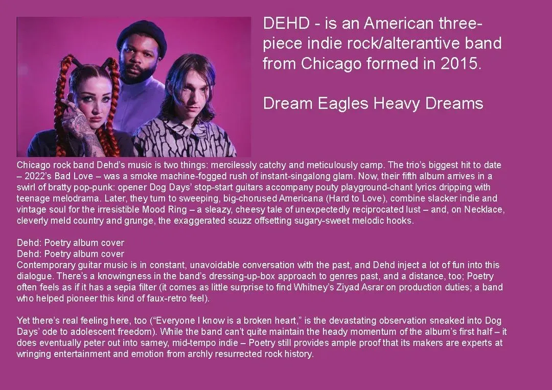
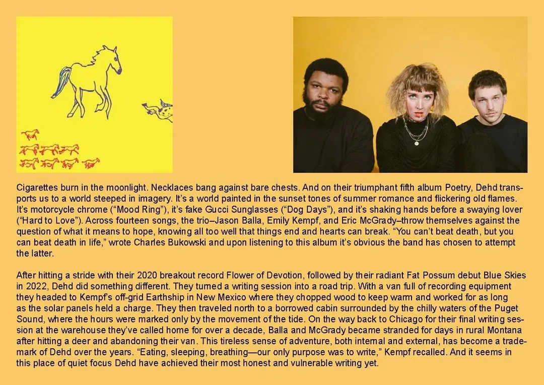
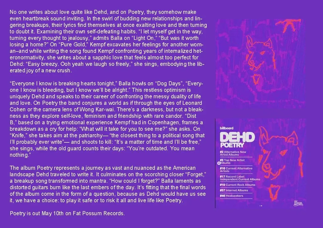
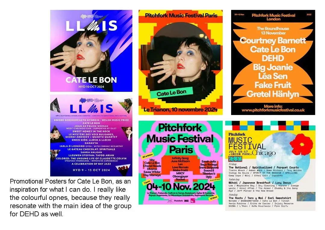
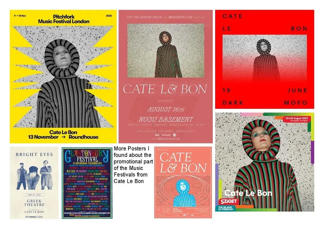
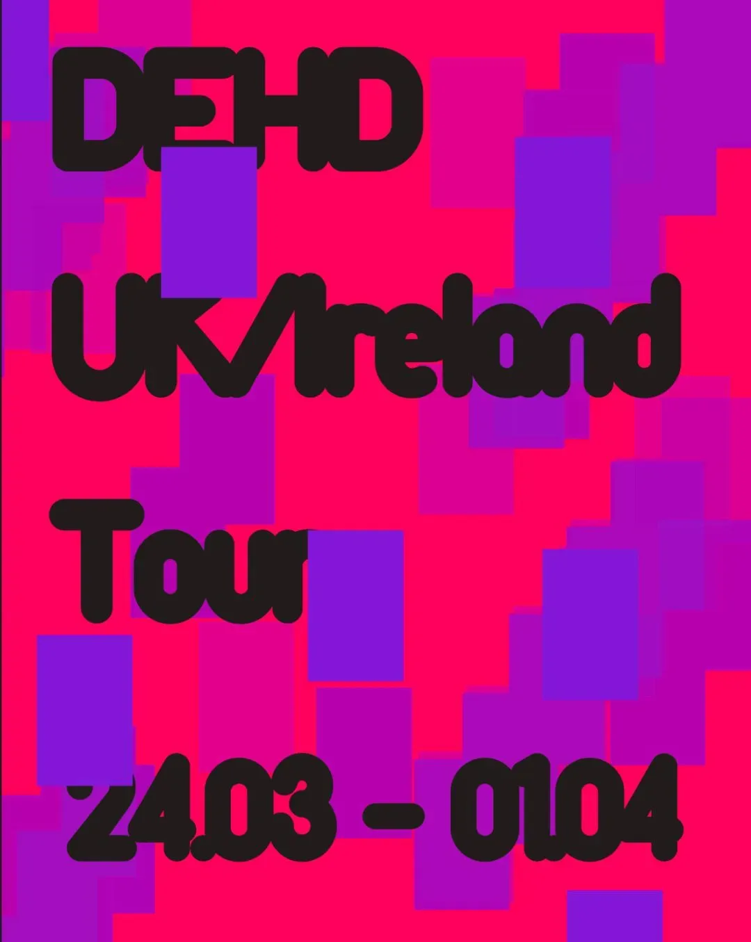
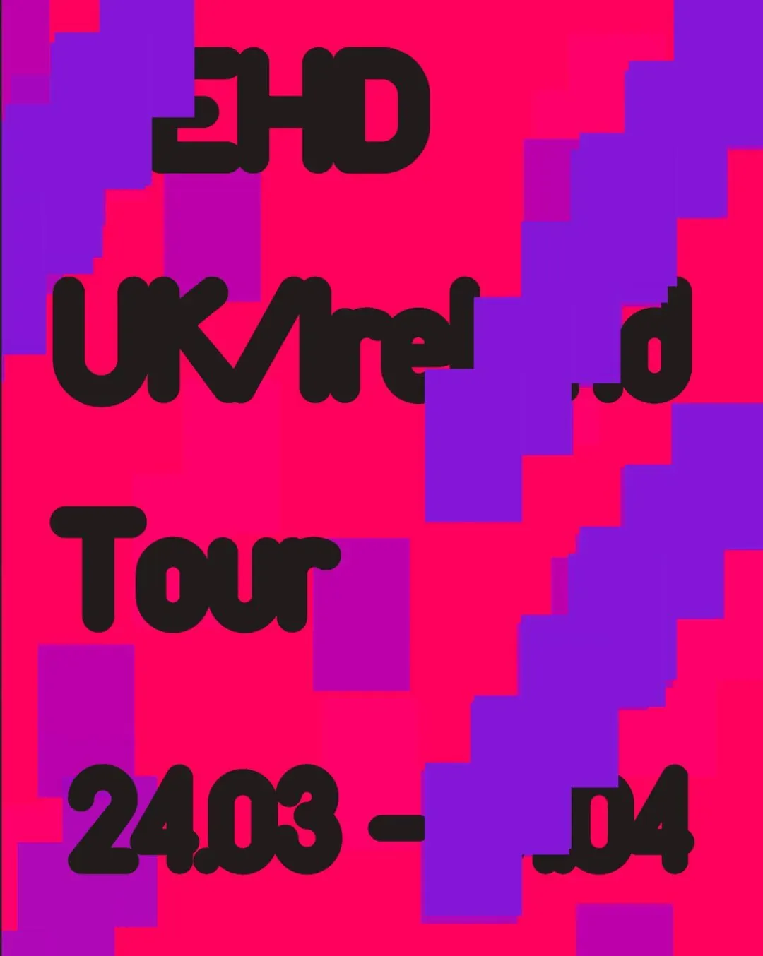
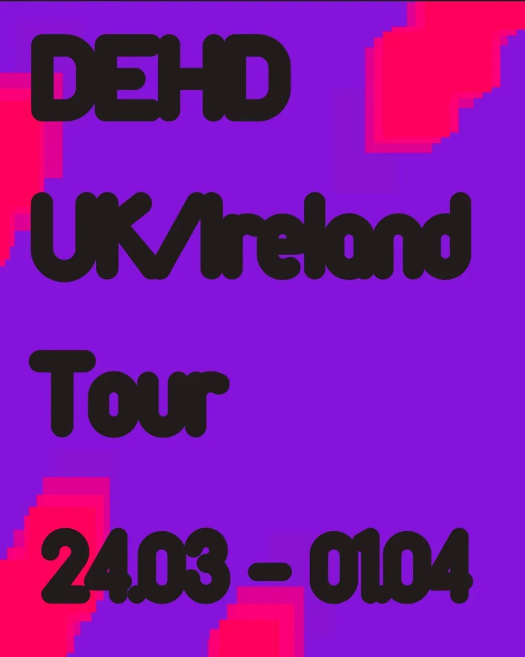
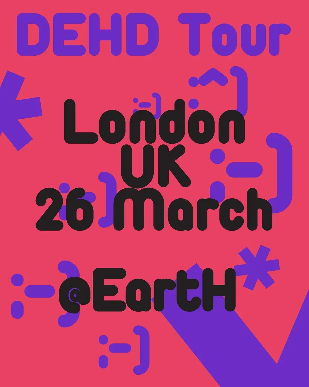
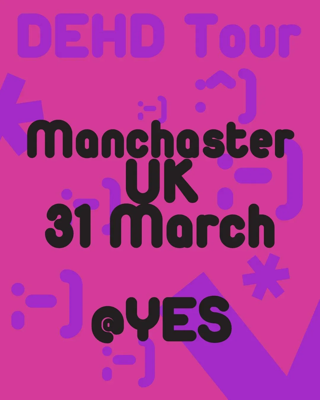
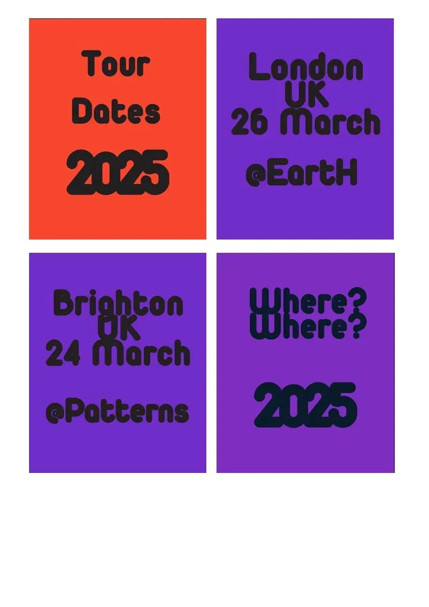
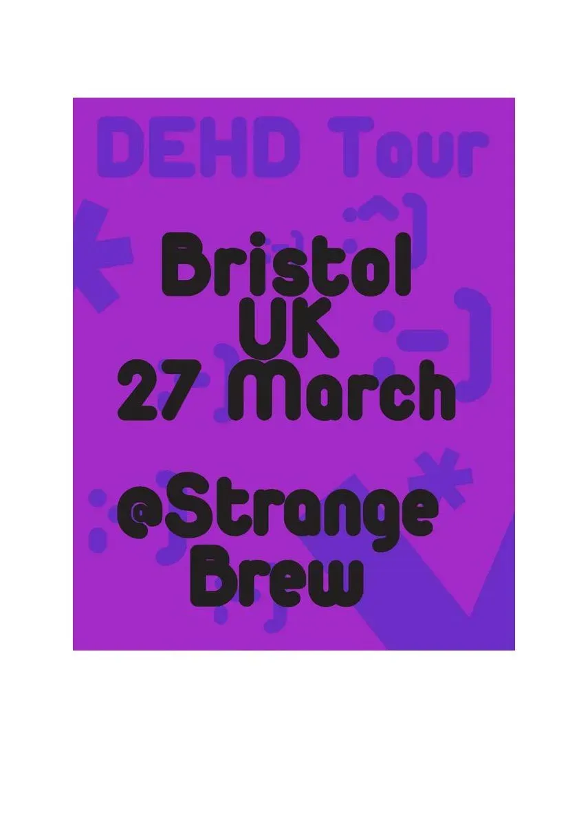
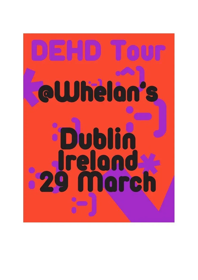
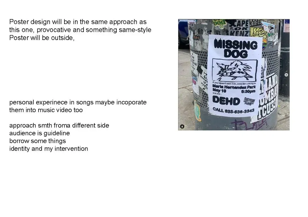
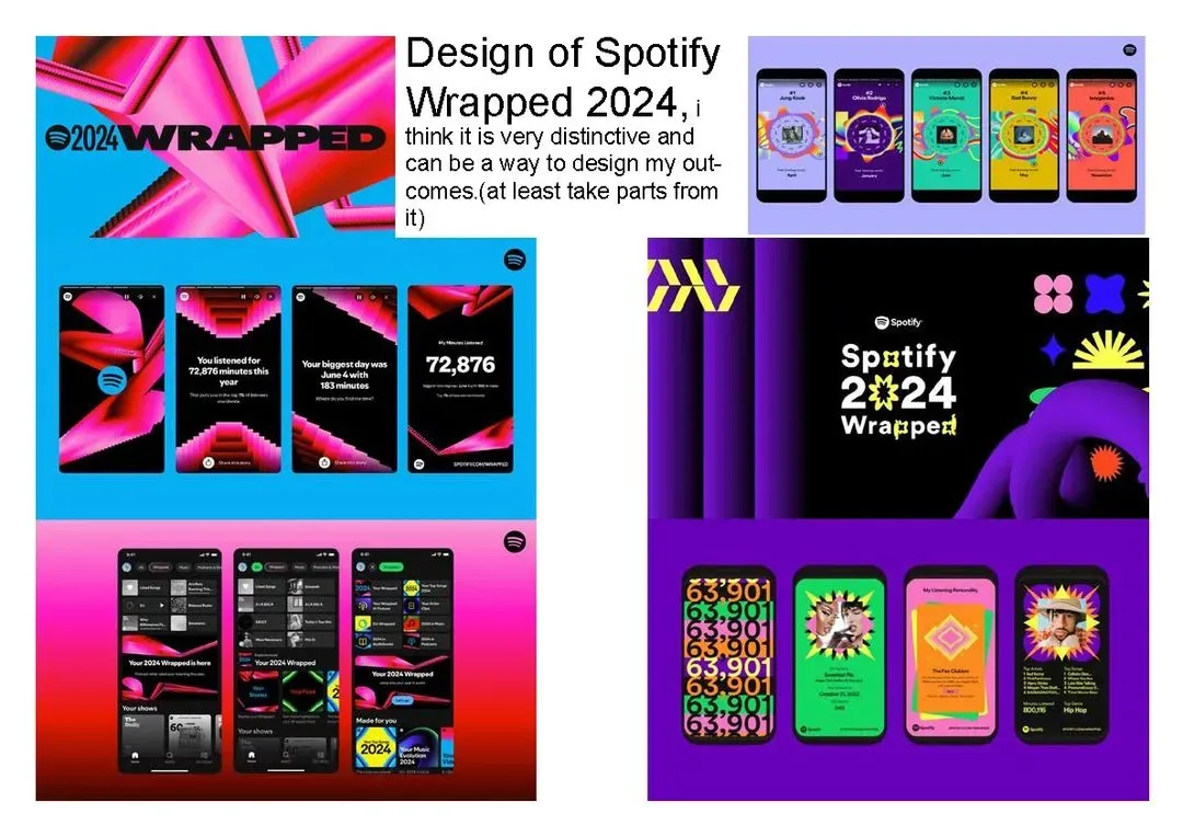
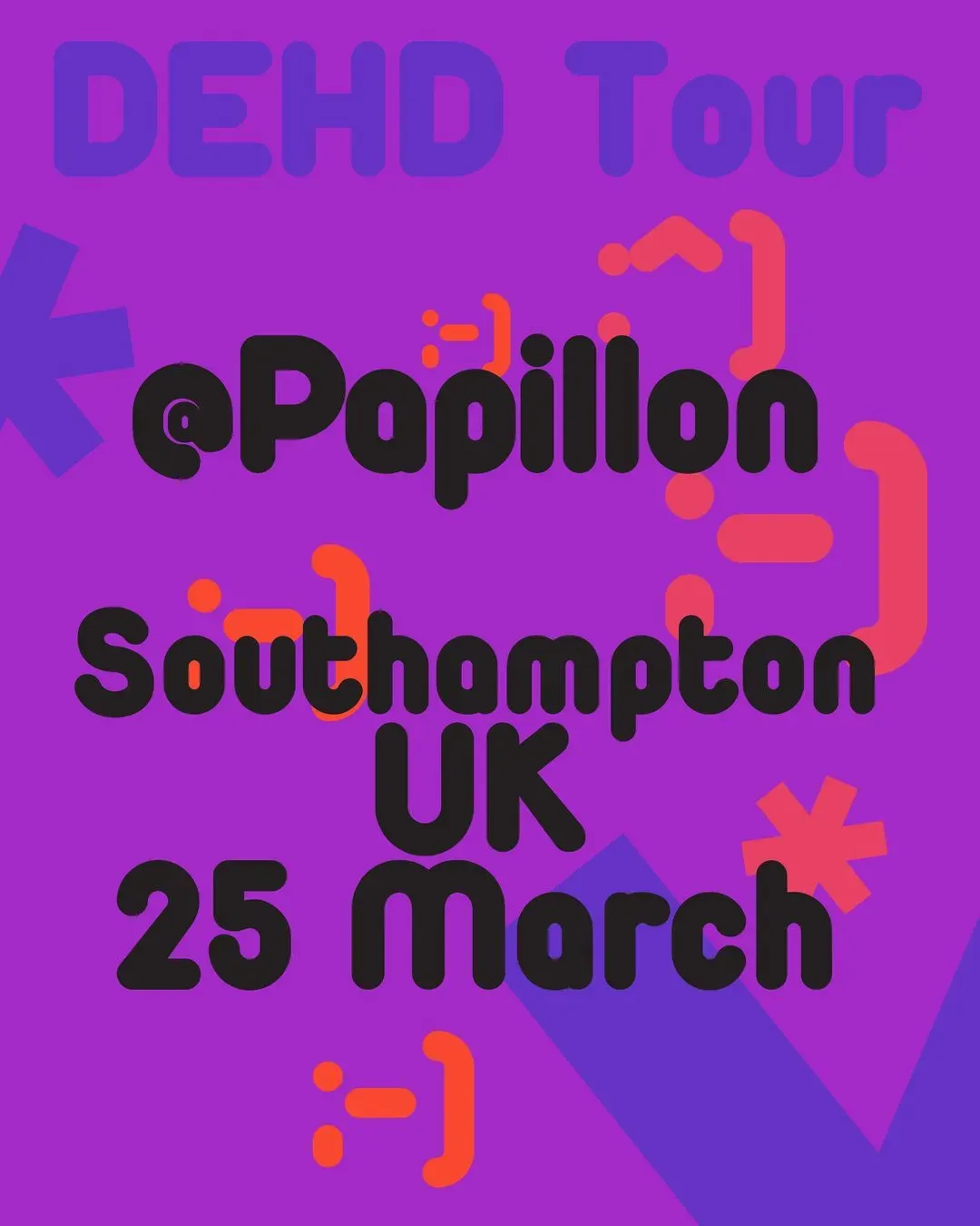
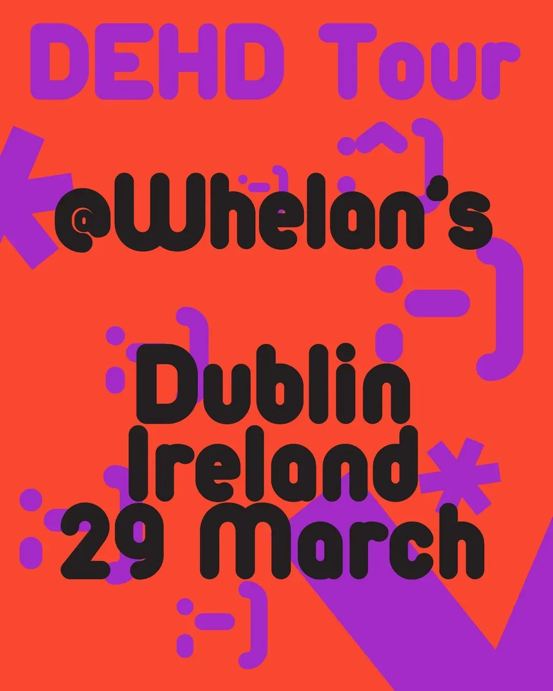
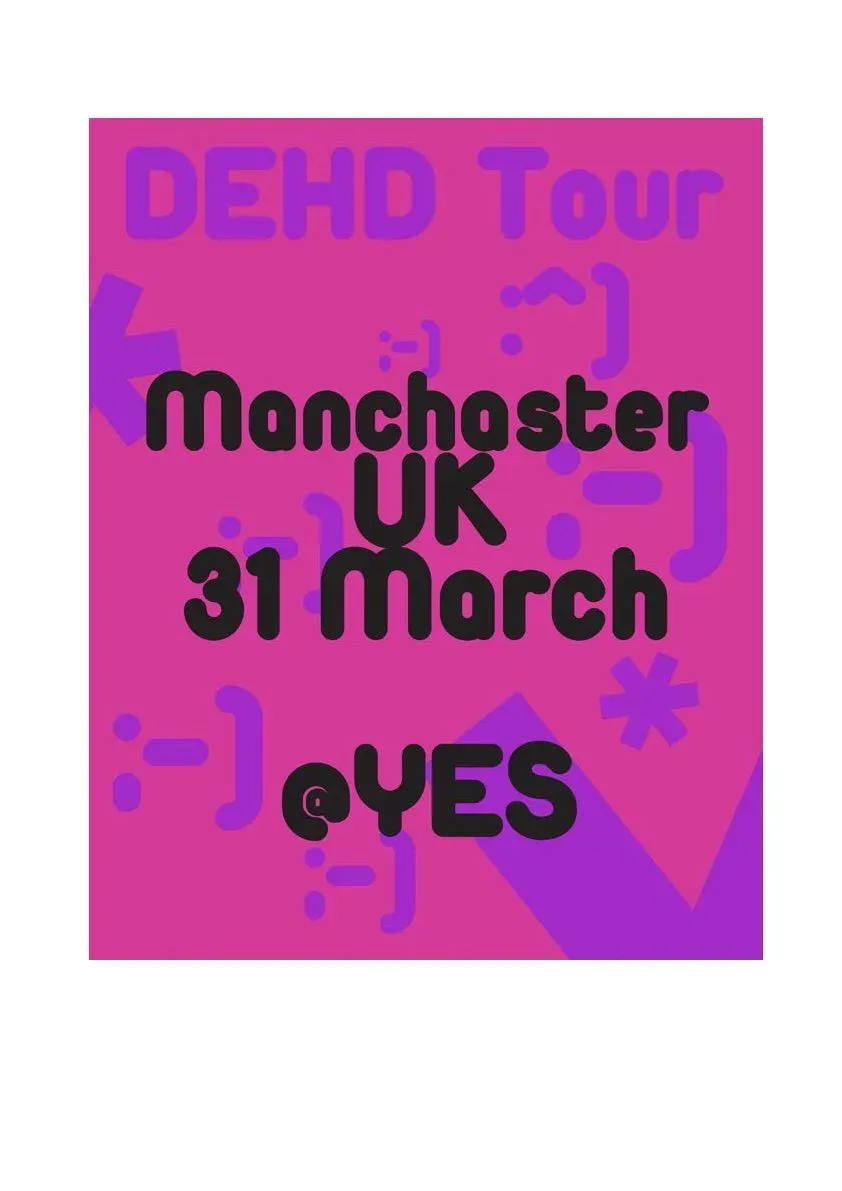
For this project, I focused on developing a bold, creative and conceptual approach for my design for the band DEHD. I have considered the fundemental role of role of sequence in this project and have experimented with the assembly of static images into a moving design, with my 30-second video promotion, a poster design and a website I have aimed to reflect the message of the band and what they sing about and at the same time, show my own style and enjoy it. Raw aesthetics, identity and a dynamic visual are what I wanted from this project. This project also is important because it combines my creativity and puts graphic design into an industry I am interested in, working in different media and multimedia. I have looked closely at the band and have understood their aesthetic to help me connect better with what they do and represent it in the best way. This was one of the most important things to take from this mod- ule. I made sure everything I did was engaging and informative, since it is a promotional video, and it must be that way. I think I can get more elements into the outcome, since it is very simple, but either way, it does its job. I had some trouble with the smoothness of the frames and the transitions between pages, but I think it is still legible. The poster design was a great way to show off the band’s true nature too, right from they are, the band is really indie, and it is really interesting to show off what it is like to be indie, so I experimented with colours and how I wanted to do this, really went into the aesthetics.
Made with Lylac